Showing posts with label portraits. Show all posts

Monday, February 3, 2014

And We're Off!

I have started SmART School once again with Rebecca Guay. This time, I am doing the every other week study course, so that frees up time to finish the book...hopefully.

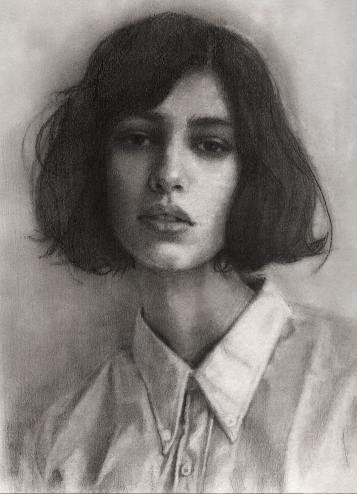
First things first. Here's another portrait artist and an example of her work followed by my the first steps of my first assignment. 


Our assignment is to come up with a cover for a hypothetical "Art of...(me)" book. Something that will most represent my work in a collection of my best work. Great assignment because it really made me dig deep and think about what is it that speaks "Kim". She emphasized that we need to focus on our strengths and build from there. I knew I wanted to include a compelling face and try for graceful lines. I started there.
 Head Study

 Composition study #1

 I felt it needed more room on the bottom.
Composition sketch #2

This is the sketch after Rebecca has worked her magic. Proportions were off on woman. Lengthened her body and eliminated her background hand, giving her a cleaner silhouette. Worked on dress and narrowed the frame. She also fixed a tangent and defined shapes. Now to get better reference for body and dress and redo.

Thursday, January 23, 2014

Happy New Year Everyone!!
 I sort of fell off the planet there for a bit. Got this stupid gomboo that has been cycling through my family. Just when I think I'm on the mend, I come down with it again. Exhausting. Whine, whine.
So, new year, fresh start. Paying attention to what I respond to without over analyzing the reasons. I've been gathering names of portrait artists for the last couple months. Thought I would share these with you. I have always responded to portraiture, the human face having such endless possibilities. You move one little muscle and you can transform the expression. I want to explore this more this year...give in to the pull and embrace it. I've determined to post one painting that buzzed my brain everytime I blog. Let me begin with...


"When I Was Young"
Love the simplicity and repetition of circles, especially the subtle halo. I will probably post more of his work.

So, I've been invited to participate in a Faery Art Show held at Krab Jab Studio located in Seattle, WA.
Due to the time constraints I went through some older photos my daughter had taken of her daughter and used that. Here are the progress shots and final:


"Sweet Pea" Sketch
 "Sweet Pea"
Oil on Paper

Detail

After this exhibit, the paintings will be deplayed at Faerie Con. I've never done this type of show. I hope she sells but it's an honor to be included with the other wonderful artists.

Monday, November 11, 2013

Jr. High Portrait Class

My oldest daughter is an Art teacher at a local charter school. For years she has run the after school art program as a volunteer. When the Jr. High needed to hire an art teacher, they asked her first. This semester, she had them do self portraits and asked if I would come in and help. We talked about proportion, basic facial placement of features. Then we discussed value and the importance of drawing what you see, not what you think you see. I taught them to turn their pictures upside down to check for mistakes and think in terms of shapes working large to small. Talked too about the angle of the line, it's placement on the surface and it's length. All in all, it was fun and I hope informative for the kids. Here are the two portraits I ended up doing in class.

Colin Morgan has such an interesting face.


Wednesday, September 18, 2013

Crave

           crave: To need urgently; require

As I am on the final finish of this current commission, my hands simply CRAVE to sketch something, anything that isn't remotely related to this children's book. Sometimes it's healthy to take a break, or so I rationalized. I pulled out a fresh piece of watercolor paper and sharpened my brand new Blackwing pencil and began a sketch of one of my sons. He's currently out of state and I only hear from him sporadically. Somehow, I felt closer to him with each pencil stroke.


Thursday, January 5, 2012

Portrait Sketch

About every other month, I like to draw something as accurately as I possibly can without the use of tracing, grid or transfer. Just good old fashioned eye-balling. I have many good photographers in the family and this photo was taken by my son, Mike. I love the lighting on her sweet, pensive expression. I worked an hour here, an hour there...taking breaks from my assignments and commissions. I could refine it more but I think I'll leave it the way it is.

Tuesday, August 2, 2011

Another Experiment

This is ready for a layer of Galkyd, but will try a layer of slightly yellowed acrylic matte medium. It's not shiny and safer to breathe. I'll then follow with oils.


Thursday, June 2, 2011

Portrait Commission

This is a commission I've been working on, along with my assignment for IMC. The client only had access to three old photos of this man so I was worried about coming up with a likeness that was accurate. I hope she will be happy with it.

Friday, March 19, 2010

Sad Faerie Sketch

Finished sketch
Updated Sketch
Will work on wings and finish hair tomorrow during sketching time.

Wednesday, March 3, 2010

Warded Man in Colored Pencil

As usual, I wasn't happy with how the oil painting version of Arlen was going, so I turned to my old stand-by, colored pencils. Once I had built up several layers I took some solvent and brush to the waxy layers and blended away, creating some depth in the shadows. Still have his robe and sword to do but I thought I would post this photo.

Thursday, December 3, 2009

Dreads - SAD

There was something about my son's dreads pulled back from his face that made for an interesting shape that I couldn't resist sketching. I'd like to finish this for a possible future portrait, but for now, it's my sketch for today.

Friday, August 28, 2009

Jeff Hein Portrait Workshop Conclusion

After lunch on the second day, I came back and tried to apply this technique to the panel. The angle I had from where my easel stood was an almost profile. The beard gave me fits too. Because it dries faster, we used burnt umber instead of asphaltum.

On the third and last day, Jeff's demo consisted of finishing the direct portrait he started on the first day, plus painting on the second method until the lunch break at 1:00.

Jeff uses a fairly limited palette: Flake White hue or replacement, Ivory Black, Transparent Yellow Oxide, Transparent Red Oxide, Burnt Umber or asphaltum, Cerulean, Ultramarine Blue, Lemon Yellow, Transparent Orange, Cad Red Light, and Windsor Red Deep and sometimes, Alizarin Crimson. But basically, he says any three primaries will work. For flesh he started off with a mixture of Cerulean blue, Windsor Red and Yellow Oxide. and white. He says "the face is the palette, not the paint", which really makes sense. And of course, don't forget the ....


..."Magic Squint". Basically, this is how I see without my glasses on and I tried drawing without them on purpose to simplify the shapes and values. Also: Paint across the form not into it.

I didn't get very far on my piece once we got back. Curse you paint!! I figure I have miles of canvas to go before it becomes my friend and a tool in my hand like the pencil. Overall, what was most impressive to me, is Jeff's work ethic. He is so disciplined and his artistic approach is a combination of passion, drive and expression. He never paints for the market. Although he loves looking at other current artists' work, he cautioned us to limit that exposure otherwise you risk "losing yourself". I have to think on that more. Other than feeling a bit discouraged at my inept attempt at painting, I came away from the workshop with oodles of notes and more knowledge to help me in my journey. All in all, very worthwhile.

Wednesday, August 19, 2009

Workshop: Day Two

On the second day of the workshop, Jeff decided to teach us a second approach to portrait painting. He realized we were all struggling with the placement of the shapes and masses without some form of under painting or drawing. He had panels all prepared for us. He puts up to 5 layers of 100% acrylic based house paint on his panels and sands them smooth.
Using the color asphaltum, and no medium, he begins drawing with his brush (likes W&N Eclipse and Monarch soft brush for this), laying down values, masses and shapes. It's pretty much the same principle, except you aren't making the decisions about color in this step. He used this step in his technique for a number of years but realized that he could eliminate it after awhile.
Jeff did a lot of talking during this demo. He said he can usually recognize an artist who lacks confidence in painting. They usually produce highly finished works, applying paint with thin layers, afraid to fuel the brushstrokes with paint and to lose edges. Er...HELL-O...that would be me.
Jeff also said that even if you use photographs for your reference, as opposed to painting from life, treat the photo like a model. Don't rely on a grid or (heaven forbid) tracing. Don't turn the photo upside down either. The only aid he used was the mirror to check for flaws. He said if you continue to use these methods, especially the grid, you will forget how to draw. He is very confident in a person's ability to learn to see and draw accurately, but it takes practice and a desire to "do whatever it takes to stretch yourself as an artist". Always be aware of angles. Create imaginary plumb lines on your canvas. He will often imagine a shape within a shape to compare size and accuracy. Of course, the "magic Squint" is vital to this process as well.
Here are the two methods, side by side. Break for lunch and it's our turn. SURE.
To be continued...

Monday, August 10, 2009

Workshop: Day One

This is Dave, our model. He was awesome. Could hold a pose for an hour without moving or needing a break. You rarely had to correct his pose when he returned. He's a poet and hiker. Poor guy had to wear the same shirt for three days straight.

Jeff began the day with a demo. He has a rather simple palette and uses no medium. He began putting down the lightest lights. He says one of the most important things to do is SQUINT, simplifying the masses and shapes and averaging out the value and color. Forget detail at this point. It's all about seeing relationships between abstract shape and value.
Jeff continued to squint and lay down more of the first layer. I'm amazed at his ability to accurately see and measure. He warned us to be wary of simultaneous contrast with both colors and values. He loads his paint and rarely makes more than three strokes before returning to his palette. He challenged us to avoid allowing the brush to touch the canvas, using the paint as a barrier. He used transparent colors in the shadows and opaque in the lights.

Here is 90 minutes worth of work. Lunch time and then....we get to try. Send in the clowns......
You can't imagine how intimidating this technique is for me. No under painting or any type of drawing. Simply applying the paint with a sure stroke while asking these 4 things: What is the 1. value; 2. color; 3.location and 4. temperature. After 3 and 1/2 hours, this was my portrait. Poor Dave. No ears or cranium or hair. On to the next day.....

Sunday, August 9, 2009

Jeff Hein Portrait Workshop

I'd like to introduce Jeff Hein. Above is a self portrait, front and back. I studied with him awhile back at his atelier in SLC and learned much under his tutelage. Last week I was able to attend a three-day portrait workshop at his studio. Jeff's style is very direct....very painterly and his flesh is dead-on. The photos don't do his work justice, but thought I would post a few of his to show his style (although, once again he is evolving).

Below is one of his earlier works that I just love.This sketch shows Jeff's newer approach. His recent works have this wonderful Rembrandt-like quality to them with his impasto and brushwork.Below is a commission portrait in progress. I love the gesture and feeling of this boy. I can't figure if it's the last day of school or the first.

Above is a work called 12 Shades and they are all on separate panels. I was able to see him paint a few of these portraits while at the atelier.
I love this family portrait. This photo was taken at one of Jeff's exhibits at the Springville Museum of Art. It's titled, "Growing Up".
Tomorrow I will post about day one of the workshop.

Wednesday, March 25, 2009

Sketch Update

I'm trying a few things with this piece. Raised the value key but increased the contrast for a more dramatic effect.

Wednesday, December 31, 2008

Sketch Update


Still spending a few minutes each day developing this sketch. Taking it slow.
Happy New Year!!

Friday, December 5, 2008

Quick Sketches

Quick sketch in my new brown bag sketchbook. I really like the toned paper and smooth bristol finish. Very colored pencil friendly. This is Po, a character from K. Cashore's book, Graceling. I had to return the book to the library so I couldn't reread his description, so this is all from memory. He has two different colored eyes, gold and silver. All "Gracelings" have two different eye colors. My daughter, Audrey has a blue eye and a grey eye, but she wears blue-tinted contacts so you can't tell. Wish she wouldn't. I think it's so unique.
Another Christmas card idea. Yeah I know.....arms are too long.

This was drawn in church last week. I went to an art gallery tonight to hear James C. Christensen and he showed several paintings that first started as sketches in church. See Tara...if you're reading this. You are in good company.


Wednesday, December 3, 2008

Portrait Final- Waiting Approval


Here is a scan of the portrait I've been working on. This sweet woman is actually 95 years old. Amazing. Although I love the layering and transparency of colored pencils, they have got to be one of the slowest mediums out there. Whew!

Monday, November 10, 2008

Portrait Update

I'm finishing the hair and did more on the face and clothing. The client agrees that we need to lighten the far side of her face, since it's too dark in the photo. I'm realizing the 'value' of a value guide, especially with the whites of the clothing. A value guide is a white credit card sized card with a hole punched out of the middle of it. Mine is laminated but it doesn't have to be. You place it over an area of the photo reference and see the value of the color in the hole and then do the same on the corresponding spot of your drawing. For me, it usually needs to be darkened, especially on the lighter value areas of the photo. My brain tells me, the clothing is white with yellow-green accents. No where does the photo match the white of the value card. The earring will probably be the lightest area of the whole portrait. The brain is constantly at odds with what the EYE actually sees and what the brain THINKS it sees.

**Thank you for all your suggestions on the previous post. I haven't had time to explore other options, but I appreciate the honest opinions of my family members and blog posters.