Showing posts with label oil. Show all posts

Monday, February 15, 2016

Every Day Original

Over a year ago, Marc Scheff and Lauren Panepinto created an online gallery called Every Day Original. I mentioned them in my last post. Basically, they offer smaller, affordable original paintings, drawings, etc. for the public. It's challenged me to have a new piece every month. This month's is called "Camouflage", a 10" x 10" oil on canvas. Here are the progress shots.


I began with a cradled canvas panel and applied 3 coats of gesso, WET sanding in-between each layer. On top of that smooth surface I drew the sketch. Next I applied a coat of acrylic matte medium which created a nice texture with the graphite.


 Next I began with oils.

 This was the first pass.
And below is the finished piece. A wonderful patron bought it within the hour which for me, makes all the hours spent on the painting so worthwhile...to know that someone out in the world connected with something I created is so fulfilling.

Monday, May 18, 2015

Arches Oil Paper

I finally got around to experimenting with a pad of Arches Oil Paper purchased a while ago. There are 12 sheets sized 12" x 16" in the pad I bought. The texture is very similar to cold press watercolor paper. The weight is 140# and much more pliable than the gessoed or matte medium sealed WC paper I've used in the past.

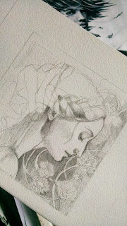
 I started sketching on a very small piece. The paper texture grabs the graphite nicely, plus it erases fairly well too. I decided to use the pencil as the underpainting for the piece.
After finishing the drawing, I mixed together raw sienna acrylic with matte medium to sealed the graphite. Up to this point, with exception to taping the border, I hadn't taped the paper down to a board. It buckled considerably after applying the acrylic mixture so I stapled and taped in on my Incredible Art Board and waited to see if it would flatten out. It eventually did but I will say, it took longer than watercolor paper. 


I slowly started building up layers of oil glaze, Establishing my darkest areas first.The paper is very absorbent, even with the acrylic medium. The more layers I applied, the more I liked the surface.

As I worked the opaque warm white into the glaze on her skin, the paper took on a soft, fabric like feel. I continued to apply glazes on the scarf to darken it. I use Daniel Smith's painting medium to help dry the layers more quickly.


"The Girl with a Curl"
10" x 10"

Here is the final painting. It sold rather quickly on Everyday Originals, which is so thrilling. I will try the oil paper again but I don't think it will replace my preferred surface, gessoed panel.

Monday, September 3, 2012

Harry Potter-Revision

After finishing the Super Hero panel, I've gone back to the Harry Potter one. I'm going to try to keep some consistencies in these portraits, namely the silhouette behind the figure, the more angular construction of the shapes, and the deeper tones of color. Unfortunately, these photos are not showing those colors as they look  in person even after fiddling with them in PS. But these will give you an idea of what I'm attempting.
I ended up putting the Sorting Hat down lower so I could show more of Harry's patronus. Also moved Hedwig on to the broom. Again, I began with a toned panel and I'm painting into glazes, trying to model the forms. This is after 2 layers of oil glazes. 


Friday, August 24, 2012

Super Hero Progress

Well, I think I'm almost through with Super Hero. Trying very hard not to over-work this. I am pleased with the colors in this painting and I'm RARELY, IF EVER happy with my colors. A big part of that was beginning on a cad red panel. That, and working into the glaze. Below, is my second pass of oils.


This is my third pass which was basically reinforcing the opaques on top of the glazes.

I still need to fix the highlights of the shield and add a slight shadow to the eyes as well as a highlight.

I prefer this technique and of course....you know what that means..I have to start over on the Harry Potter one. Been doing some sketches (below). I also like the shadow shape behind the figure so I'm thinking I will do Harry's Patronus or perhaps a silhouette of Hogwarts? I have his third panel in semi sketch state which will show him as a Junior Ranger on top of his own mountain, Mt. Owen (in the Tetons).
But for now, it's back to the children's book I go.


Tuesday, August 21, 2012

Super Hero Continued

Once the sepia lines dried over night, I applied a glaze of Transparent Red Oxide and Trans. Brown oxide combined with a mixture of OMS, walnut oil, and Daniel Smith Painting medium. Then comes the fun part. I start adding the colors into the glaze. At first, it doesn't blend very well, but you wait for the glaze to become slightly tacky and you can manipulate the paint much easier. And I'm loving the cad. red surface. It's doing very interesting things. You can't tell very well in these photos but the orange shows through in place adding interesting texture and contrast to the painting. One more pass after this dries and it will be done. I just need to watch I don't over work it. Darn. Now I want to do Harry Potter all over again using this technique. 

Monday, August 20, 2012

Super Hero

I'm nearly finished with the Harry Potter inspired portrait of my grandson (pictures forthcoming). This is going to be a triptych of sort, highlighting the three aspects of his personality. This is the second one. He is a HUGE Super Hero fan, especially after seeing the Avengers movie. On this one, I'm trying a different technique. I painted over an old study  wooden panel with a Cad Red/white mix. I quite like the texture that is showing through the paint. After it dried, I free-handed the sketch and then darkened the lines with a sepia Prismacolor.  Next, I will paint in the lines with oil so I don't lose them under my oil application. 

Saturday, August 4, 2012

Harry Potter/ Grandson Portrait

First off, thank you for leaving your nice comments for the free print
Remember, you have until midnight MTS on the 6th to post a comment to win. 
MEANWHILE, I've continued with this little Harry Potter portrait for my grandson. I made some corrections and changes on the sketch, scanned it in and then printed in out on a sheet of watercolor paper. Next, I mounted it on a 6"x 12", 1/2" cradled panel, using acrylic matte medium. Applied two coats on top of the sketch to seal the paper. 


Next, I applied a coat of acrylic mixed with medium. It was too opaque, so I wiped most of it off and went over the lines with a sepia colored pencil. That way I can see it better when I apply the acrylic tone. I also added the name of the spell and the house....had forgotten he wanted that. I plan to do them very subtlety...with just a slight shift in value from the background so they don't stand out too much.  

Well, better get back to the children book. I have two more ready to be mounted and painted. Will post in a few days.

Wednesday, June 13, 2012

Vin from Mistborn

 Ever since I picked back up with my art, I've enjoyed doing fanart from books and movies. There are many authors who can create such convincing characters, I just have to try to see them visually, on paper. If you aren't familiar with Brandon Sanderson, I suggest you pick up his Mistborn trilogy to start. I read the first one years ago and was so upset about the death of a certain character, it took me 2 years before finally continuing and finishing the series. It's one of my favorites now. After finishing the first book, I wanted to draw a scene that happens at the end. Vin, the main female character, goes off into the night to grieve. She simply gives over to her sorrow and anger and floats above the city, questioning her purpose and future. The mists come and envelope her. Here is the first pass of oils on board. I have no idea how I'm going to pull the tops of the buildings up through the mists....always a struggle to put on paper what I see so clearly in my head.

FYI: These are photos so the colors are slightly skewed.


Friday, June 1, 2012

Hungry Bird Final

After finishing the sketch on illustration board, I toned the board with a neutral acrylic wash. Next I put a layer of matte medium and proceeded with oil.

My daughter was very specific about the colors. It's supposed to match a quilt we made her little girl. The yellow is a true spectral hue but the blue is half way between weird blue green. Took me awhile to mix the exact shade. I couldn't get the tutu to look right so I changed her outfit (plus it was too much pink).
My camera was misbehaving so it's not exactly true to the real colors...a bit too bright. I will scan it when it's completely dry.


UPDATE: Here's the final scan. Big difference in color.

Saturday, August 27, 2011

Antiphon - First Layer of Oil

Excuse the glare. This is very rough. I'm trying to be aware of temperature changes as the light travels across the planes of the form. I'm also hoping this painting can be less tight. Want to be freer with the application.That's the plan.

Tuesday, March 29, 2011

Almost Finished

Need to fix a few things here and there. Paint in hair strands. a few eyelets in fabric. I think the likeness is there for the most part.

Wednesday, March 23, 2011

Progress in Oil

Trying to paint on a linen board. It soaks up the paint way more than I'm used to. Not sure I like that. If anyone's wondering, that's a shadow coming across her face. Looking pretty harsh at the moment...none too subtle. The paint is not pliable at all on this surface. I keep repeating my motto....this is all about learning.
Here's the progress on the face and background.. Got the ribbon in too.

Saturday, March 19, 2011

Grisaille Approach - Part Deux

Here's the first swipe of oil. I'm trying to use glazes and then work in opaques on the lit side of the picture. I like the fact that the values are already in place because of the under painting and show through the transparent shadowed areas.
Frankly, I don't know what I'm doing but it is fun and I'm not going to worry about making mistakes. This is about learning. At least, that's what I'm telling myself.

Wednesday, March 16, 2011

Grisaille Approach

The other day on Facebook, artist David Gray showed several pictures of a painting in progress using the the grisaille method for a under painting using various shades of value mixed with raw umber and white. Yesterday, using a photo of another one of my granddaughters I tried this method. It's sort of like sketching with your brush and it took me awhile to get the hang of it. I will wait for this to dry and then start painting on top.

Sketch Painted

Miss Olivia Mae
In an earlier post I talked about Melissa Peck and how much I love her work. I asked her permission to play around with her style for portraits of my grandchildren. Here is the sketch from a few days ago painted in oil on panel. I still have a few things to go in and fix.

Tuesday, September 14, 2010

More Experimenting with Oil

I first put down a tone of green ochre mixed with alizarin crimson.
Let that dry and next applied flake white on the lightest areas of the painting. Next I will build up the form with blue-greens and reds and then finally, apply glazes over that. Don't have any idea what I'm doing but read about this "Verdaccio" technique in an article by Adrian Gottlieb in the most recent Artist's Magazine. Thought it would be fun to try.
I've continued to work on Lady of the Lake. Am liking face a little better. On to the hands.

Wednesday, September 8, 2010

Lady of the Lake Revisited

Back in 2009 at IMC, I selected the Lady of the Lake assignment. I ended up finishing it digitally instead of in oils. I promised Rebecca Guay I would redo it in traditional medium. I pulled out another idea I had for it and thought it would be fun to try two different oil applications per picture. With the first photo I'm attempting to put down the bigger value shapes, taking an average of the value in shadow. I'll then go back in and bring out the subtle shifts in temperature and value on my second layer.

On this one I'm applying the oils in glazes, working wet in wet, allowing the graphite sketch to show through like an under painting. You can't see it in this photo, but the sketch looks really neat coming through the semi transparent layers, almost resembling the veins underneath the skin. I will let this dry and then fix some of the problems, especially the mouth. The paint was getting too tacky to do any more.

Tuesday, September 7, 2010

Beauty and the Beast


The oil is still tacky so I can't scan this yet, but I had to send it in. I've tried to color correct this but it's still too dark. The look I was going for was that of raw silk. I decided to change the background and place them in front of a screen to symbolize the prince hiding behind the spell of the tiger's pelt. I began this in watercolor after printing the sketch off on Epson Radiant White watercolor paper. For some reason, it started to flake off when I started applying colored pencil. So I sealed it and applied oil paint on top of that. Tara Chang gave me the idea for the second one which I did in Photoshop, just to see how it would look. Thanks Tara.

Thursday, July 29, 2010