Next was selecting a book. This was harder than it seems, especially for someone who reads...A LOT. So many titles ran through my head but what floated to the top was The Snow Child by Eowyn Ivey. This book came into my life after losing a granddaughter and the older couple in the story struggled with their own grief and pain while finding hope and healing through the hardships of the Alaskan wilderness. There's also this ambiguous nature of the girl who comes into their lives. Is she fairy tale or real?
With my choice made I listened to the book again, taking lots of notes and came up with several ideas. None of them seemed right or good enough, especially considering the other amazing artists involved. My confidence, or the lack of, was hobbling my decision making preventing me from moving forward. I reached out to Dan Dos Santos, book cover artist extraordinaire and his advise helped me break through the barrier of blocks I had put in my way. This is part of his response:
I love the book I chose, and so I'm painting this piece for me, not someone else. If I were you, I would do the same. Don't worry about what you think the piece SHOULD look like, or what size it SHOULD be, or if it's cover-y enough. Just paint something beautiful that interests you. If it's pretty and sincere, it's going to resonate with the audience and do well. It's really not more complex than that. There are times when making compromises are beneficial for marketing purposes, but I don't think this is one of those cases. I think it's more important you make something you're passionate about. This is a gallery piece. Let the tangible painting be the priority, not the fake cover treatment.
These wise words were just what I needed. I moved forward, trying to keep it honest and simple. Here's the process I went through:
Rough thumbnail.
Digital color.
Digital mock-up. The colors are quite specific in the book and after listening to it again I realized it was a red scarf not a hat that she wore. This actually helped give the child a more wild look, with her hair loose.
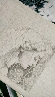
This is the final sketch. The surface is vellum which allowed me to use both sides of the paper. I scanned it in, ghosted it with a layer of white and printed it out.
I began with colored pencils and slowly, with very light layers built up her skin tones and eyes. I put down the rest of the base colors and sealed the color pencil with matte medium. I then went in with oil glazes. I ended up bringing in tree branches in the background.
Here is a snippet of the final painting. I'll show the full picture once they start advertising for the show. She's at the framers right now and then I'll ship her off. I've seen a few other pieces from the show posted on Facebook and all I can say is this show will be spectacular and I am so honored to hang with some of the best in the industry.


